Go back
CVS ScriptSync & 90-Day Refill Experience
Project Overview
This project focused on improving the prescription refill experience by designing a more intuitive and accessible mobile app. The goal was to support users in managing their medications with fewer steps and better reminders, especially for those using CVS's ScriptSync and 90-day refill options.
The Challenge
Medication adherence is a big deal. Many patients were forgetting refills, missing doses, or juggling multiple prescription dates. This not only impacted their health, but also overloaded pharmacists and affected refill rates across CVS pharmacies. The goal was clear:Make it easier for users to manage and refill their prescriptions, on time, every time. Our focus areas were ScriptSync (which lets users sync all their meds for a single pickup) and 90-Day refills (which promote long-term adherence and reduce pharmacy trips).
My Role
As the Sr. UX Designer on this initiative, I focused on understanding user behavior around prescriptions and simplifying the refill journey inside the CVS mobile app.
I worked closely with product, pharmacy ops, engineering, and legal to ensure our solution balanced user needs, business goals, and compliance.
Research: Why Patients Were Falling Behind
We kicked off with user interviews and journey mapping. I spoke with patients, caregivers, and pharmacists.
Here’s what we uncovered:
People often didn’t realize they were eligible for 90-day refills.
ScriptSync was underutilized, mostly due to unclear messaging.
Managing multiple prescriptions felt fragmented and time-consuming.
This helped us frame our design challenges:
How do we guide users to the right refill type?
How can we show the value of ScriptSync without overwhelming them?
How do we build trust when dealing with something as sensitive as health?
Design in Action
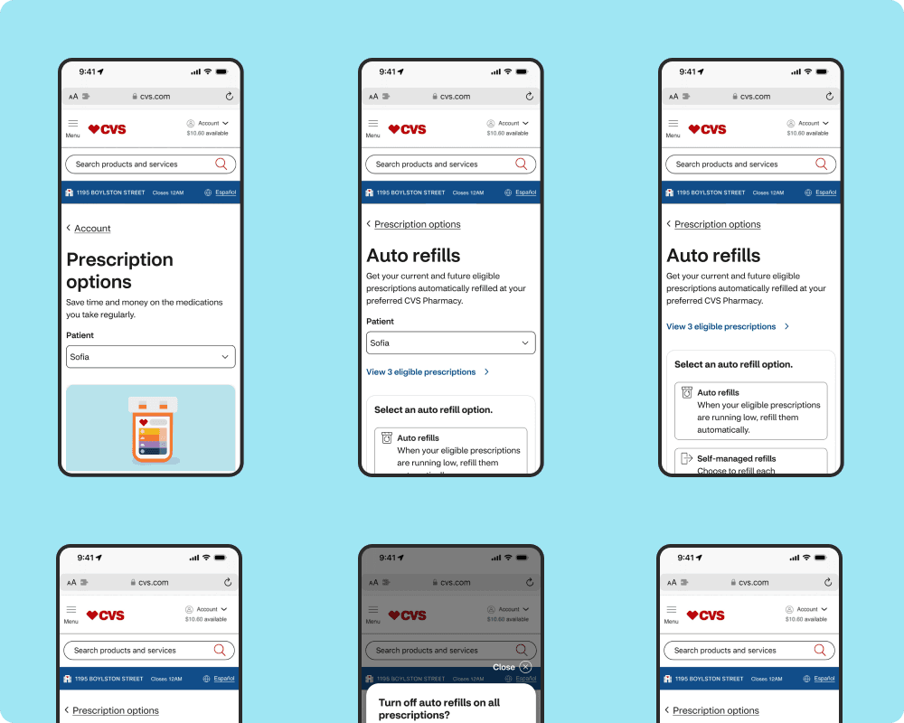
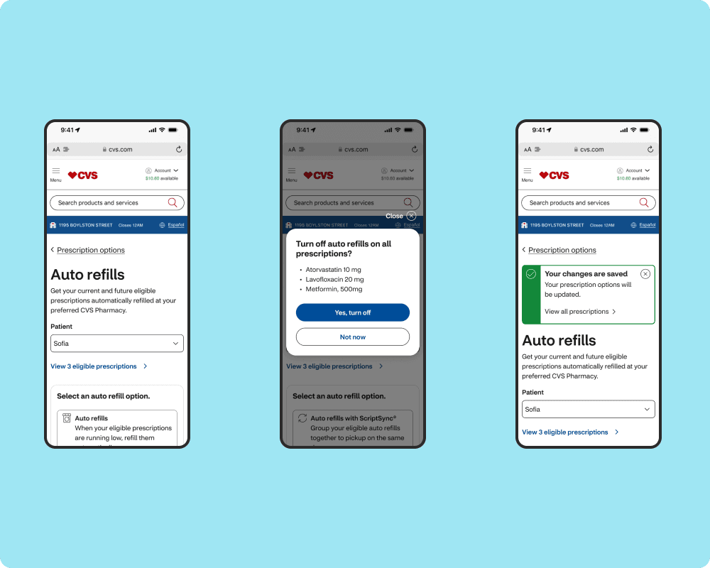
1. Simplifying the Message
We redesigned the ScriptSync and 90-Day banners with clear, personalized CTAs. Instead of generic alerts, users saw messages like:
“Sync your 3 active prescriptions for a single pickup this month.”
2. Guided Enrollment
I created a step-by-step flow that explained the benefits, answered questions upfront, and minimized the clicks needed to enroll.
We used progressive disclosure—only showing info when needed—so users wouldn’t feel bombarded.
3. Visualizing Time Saved
We added a dashboard showing how much time (and trips!) users saved by syncing and switching to 90-day refills. This helped drive adoption.
Solution
This project focused on improving the prescription refill experience by designing a more intuitive and accessible mobile app. The goal was to support users in managing their medications with fewer steps and better reminders, especially for those using CVS's ScriptSync and 90-day refill options.
User Testing & Insights
We ran moderated usability tests with 10 patients across age groups. A few takeaways:
Users loved having a visual tracker for refill status.
Caregivers appreciated being able to sync prescriptions for dependents.
Some users hesitated due to insurance questions, we added tooltips and pharmacy support links.
After a few iterations, we found the right balance between education and action.
Business & User Impact
ScriptSync enrollments increased by 21% within 6 months.
Missed refill alerts dropped by 18%.
25% more users opted into 90-day refills, reducing pharmacy visits and improving retention.
Takeaways
This project showed me how good design can literally improve health outcomes. It wasn’t just about UX, it was about trust, clarity, and removing friction in a process that deeply affects people’s lives.
It also reminded me that small improvements (like a better tooltip or a simplified CTA) can lead to big results when they’re rooted in real user behavior.


