Go back
Apple Event – Session Registration Redesign
Project Overview
Apple hosts internal launch events with multiple sessions. Employees register for the main event but often miss joining individual sessions or lose track of what they’ve signed up for. We designed a clean, guided experience that allows users to view, join, and manage sessions confidently and quickly, improving participation and reducing confusion.
The Challenge
Apple organizes internal product and team launch events with multiple parallel sessions. Employees would register for the main event, but many were confused about how and when to register for individual sessions. This led to: Missed sessions after registering for the main event Confusion around session status, whether they had already joined or not Lack of clarity about session content and timing Poor visibility across joined and available sessions The result was a fragmented experience that didn’t scale well, created helpdesk inquiries, and left employees disengaged. We set out to design a more intuitive and transparent experience.

Objective
Design a clean, intuitive, and scalable experience that allows employees to:
Understand that event and session registration are separate actions
Discover, preview, and register for sessions with minimal friction
See real-time confirmation of their session status
Easily manage their session participation after registering
Research & Insights
Our user research included interviews with past event attendees and operations staff. We found consistent themes:
Users thought registering for the event meant they were automatically added to all sessions
They missed session details because the current “Read More” interactions were hidden or unclear
After registering, users had no easy way to track which sessions they had joined
These insights gave us the foundation to reimagine the session flow, from landing to confirmation to management.
Design Breakdown
We divided the experience into key screens and states, addressing each problem through focused UI updates.
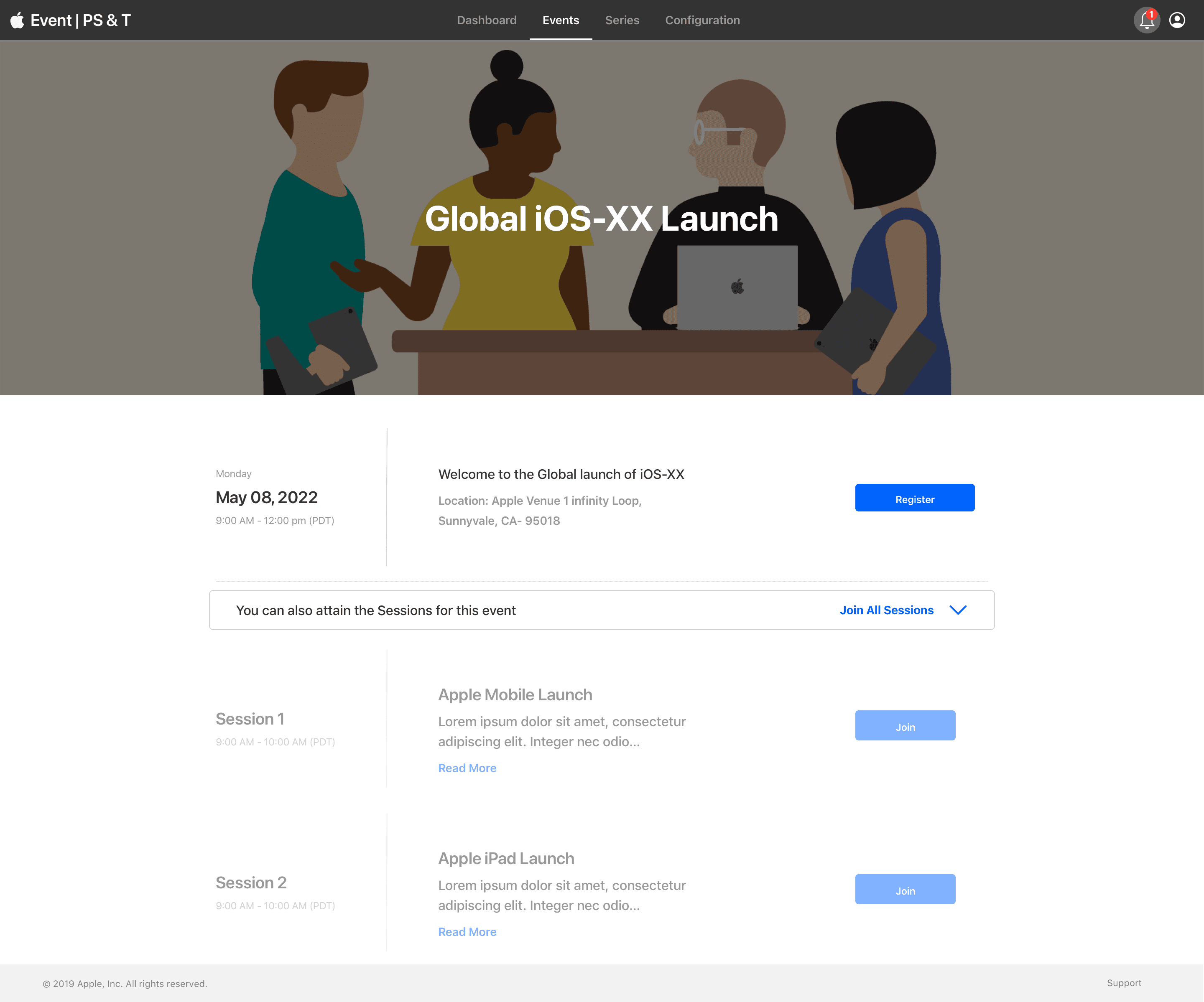
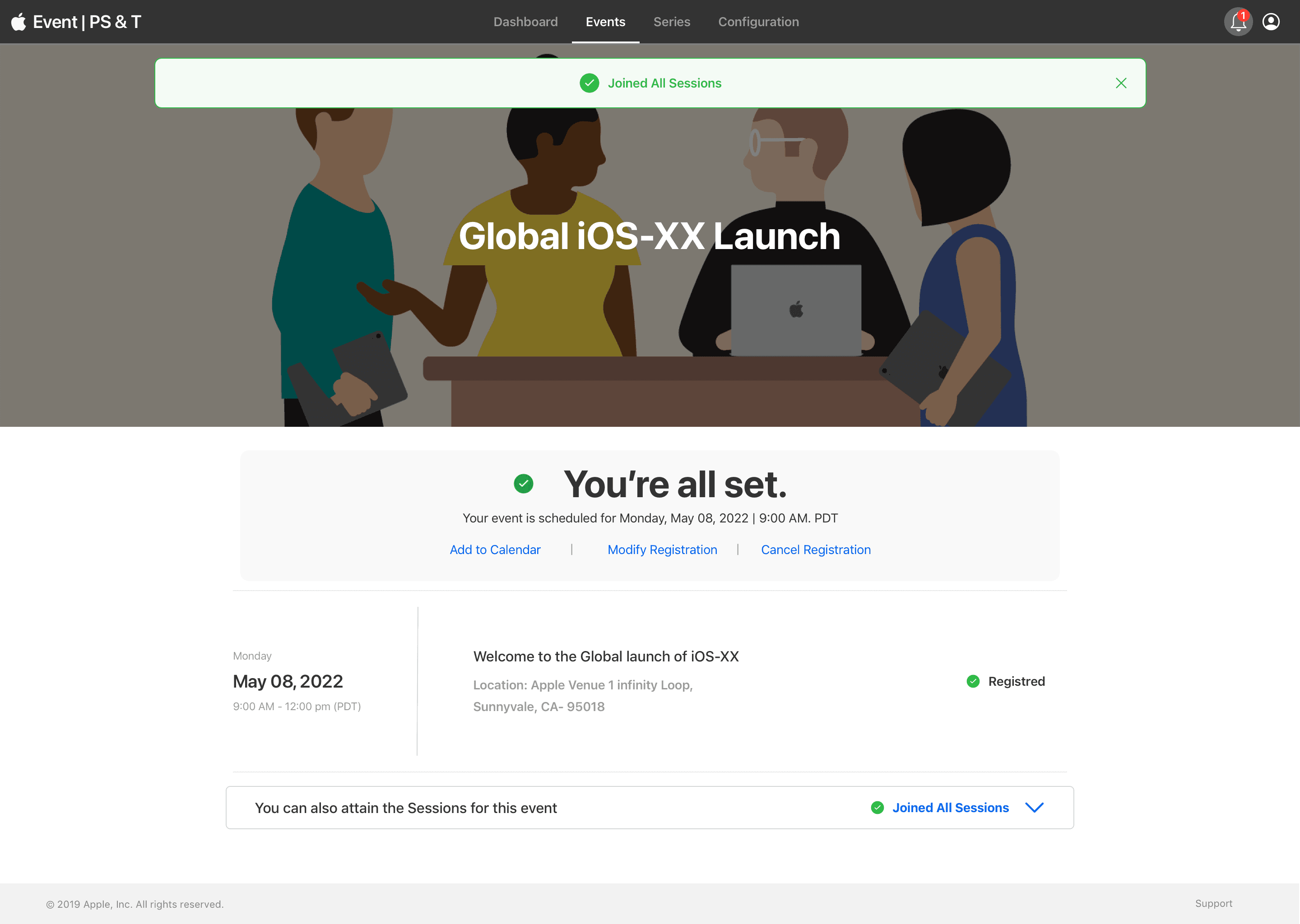
Registration Confirmation Page
After completing the event registration, we displayed a clearly structured confirmation message:
“You’re all set. Your event is scheduled for Monday, May 08, 2022 | 9:00 AM PDT”
Along with calendar integration and registration management actions, this message created a natural transition into the next step, joining sessions.
Session Discovery Section
Below the confirmation, we added a clear prompt:
“You can also attain the Sessions for this event.”
This introduced a scrollable, modular session list that included:
Session title, time, and brief description
A prominent “Join” button for each session
A visual status indicator when a session was already joined
A “Read More” link to preview extended session details
Read More Interaction
The “Read More” feature expanded the session card in-line, offering:
Detailed session description
Additional context for employees to make an informed decision
Clear actions (Join/Leave) at the end of the content
This allowed users to preview multiple sessions quickly, without navigating away from the main screen.
Joined Sessions Dropdown
To improve visibility into session status, we introduced a compact dropdown banner:
“Joined 1/5 Sessions”
Clicking this revealed all currently joined sessions, with quick access to leave or rejoin. This real-time tracker helped employees feel in control, minimized redundancy, and improved transparency.
Solution
We introduced modular session cards, real-time status tracking, and inline “Read More” previews to improve discoverability. A session summary banner gave users a quick glance at their progress. With clear CTAs and feedback, employees could now register, track, and revisit their sessions in just a few clicks, making the experience seamless across events.
Validation & Testing
We conducted usability testing with internal employees:
Most users completed session registration without guidance
The “Read More” and “Joined” tags were widely understood
Users appreciated seeing their session count update dynamically
After incorporating feedback, we added tooltip support for less familiar terms and streamlined the layout for mobile compatibility.
Outcome
35% increase in session participation across all internal launches
40% reduction in internal support requests for event/session issues
Consistently positive feedback on clarity, simplicity, and session visibility
Reflection
This project showed how important micro-interactions and state clarity are when designing for large-scale, multi-session event platforms. It wasn’t about reinventing the registration process, it was about helping users feel confident, informed, and in control at every step.
By combining thoughtful content structure, consistent feedback, and scalable UI patterns, we delivered a solution that not only solved the problem—but raised the standard for all future event experiences at Apple.


